자주 사용되는 UI Animation 구현해보기

안드로이드에서 애니메이션을 사용하기 위해서는 디자이너분께서 주시는 gif파일을 Lottie라이브러리를 사용하였습니다. 하지만 gif파일이 없더라도, 안드로이드에서 애니메이션 효과를 구현하는 방법이 여러 가지가 있길래 공부해보고 싶어서드로이드나이츠2020 -안드로이드 UI에 Animation 들이붓기를 참고하여 실습해 봤습니다.
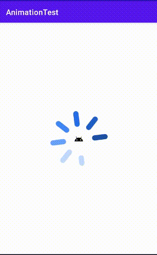
Loading Animation
: ProgressBar + Drawable를 이용한 로딩 애니메이션을 만들어보겠습니다.
- 먼저 로딩할 때 애니메이션을 적용하려면, drawable파일을 만들어줘야 합니다.
res/drwable/loading.xml
<?xml version="1.0" encoding="utf-8"?>
<layer-list xmlns:android="<http://schemas.android.com/apk/res/android>">
    <item android:gravity= "center" android:width="100dp" android:height="100dp"> //바깥의 테두리
        <rotate
            android:drawable="@drawable/loading_outer"
            android:pivotX="50%"
            android:pivotY="50%"
            android:fromDegrees="0"
            android:toDegrees="360"/>
    </item>
    <item android:drawable="@drawable/ic_android_black_24dp"//안쪽 이미지
        android:gravity="center">
    </item>
</layer-list>- android:pivotX : 회전축의 X좌표
- android:pivotY : 회전축의 Y좌표 (x,y)기준 !
- android:fromDegrees : 시작하는 회전 각도 (원래 이미지에서 해당 각도만큼 시계방향으로 틀어서 시작합니다. ex ㄱ 이라는 이미지를 넣고 180이라고 설정하면 ㄴ 모양에서 시작! )
- android: toDegrees : 끝나는 회전 각도
- android:width & android:height : 이미지 사이즈 조정
- 만들어둔 애니메이션을 ProgressBar에 적용하면 됩니다!
res/layout/activity_main.xml
<?xml version="1.0" encoding="utf-8"?>
<androidx.constraintlayout.widget.ConstraintLayout xmlns:android="<http://schemas.android.com/apk/res/android>"
    xmlns:app="<http://schemas.android.com/apk/res-auto>"
    xmlns:tools="<http://schemas.android.com/tools>"
    android:layout_width="match_parent"
    android:layout_height="match_parent"
    tools:context=".MainActivity">

    <ProgressBar
        android:id="@+id/progress_loading"
        style="@style/Widget.AppCompat.ProgressBar"
        android:layout_width="300dp"
        android:layout_height="300dp"
        android:indeterminateDrawable="@drawable/loading"
        android:indeterminateDuration="5000"
        app:layout_constraintBottom_toBottomOf="parent"
        app:layout_constraintEnd_toEndOf="parent"
        app:layout_constraintStart_toStartOf="parent"
        app:layout_constraintTop_toTopOf="parent" />

</androidx.constraintlayout.widget.ConstraintLayout>- android:indeterminateDrawable : 만들어둔 애니메이션을 여기다가 적용해 줍니다.
- android:inderterminateDuration : 만들어둔 애니메이션의 효과가 해당 5000ms 동안 나타납니다.
하지만, 항상 로딩 애니메이션을 보여주는 것보다 API응답 속도가 느릴 때만 로딩 UI를 보여주고 싶다면 ContentLoadingProgressBar를 사용하면 된다고 합니다.
Progress Animation
: 재생, 녹화, 다운로드 등 어떤 작업의 진행상태 및 완료를 나타내고 싶을 때 사용하는 애니메이션입니다.
앞의 예제에서는 outer이미지를 가져와서 rotate해주는 방식을 사용해서 애니메이션을 만들었는데, 여기서는 item의 shape를 이용해서 진행상태를 나타냅니다.
- 먼저 진행상태의 배경을 만들어줍니다!
res/drawable/progress_background.xml
<?xml version="1.0" encoding="utf-8"?>
<layer-list xmlns:android="<http://schemas.android.com/apk/res/android>">
    <item> //외부 흰색 원
        <shape android:shape="ring"
                android:thickness="5dp"
                android:useLevel="false">
            <solid android:color="@color/white"/>
        </shape>
    </item>
    <item android:drawable="@drawable/ic_android_black_24dp"//내부 이미지
        android:width="100dp" android:height="100dp"
        android:gravity="center"/>
</layer-list>- android:shape : rectangle | oval | line | ring이 있습니다.
- android:thickness : 진행상태 배경 라인의 두께를 정합니다.
- android:useLevel : drwable을 부분적으로 그릴 수 있도록 한다고 합니다! LevelListDrawable로 사용되는 경우 true이며, 일반적으로는 false입니다. (true로 설정하면 보이지 않습니다.)추가설명
- 그다음, 돌면서(움직이면서) 진행율을 나타내줄 drawable파일을 만들어줍니다.
res/drawable/progress.xml
<?xml version="1.0" encoding="utf-8"?>
<rotate xmlns:android="<http://schemas.android.com/apk/res/android>"
    android:fromDegrees="270"
    android:toDegrees="270">
    <shape android:shape="ring"
        android:thickness="5dp"
        android:useLevel="true">
        <solid android:color="@color/purple_200"/>
    </shape>
</rotate>
앞의 배경과 거의 비슷한 코드이지만, useLevel = true를 해줘야 차오르는 모양을 나타낼 수 있습니다.
(12시부터 시작하고 싶다면, fromDegrees와 toDegrees를 각각 270으로 해줘야 합니다. 다른 각도에서 시작하고 싶다면 값을 넣어보면서 감을 익혀야 할 거 같습니다 ㅎ..)
- 마지막으로 앞의 예제처럼 Progressbar에 적용하면 됩니다.
res/layout/activity_main.xml
<ProgressBar
        android:id="@+id/progress_charging"
        style="@style/Widget.AppCompat.ProgressBar.Horizontal"
        android:layout_width="300dp"
        android:layout_height="300dp"
        android:indeterminate="false"
        android:progressDrawable="@drawable/progress"
        android:background="@drawable/progress_background"
        android:max="500"
        app:layout_constraintBottom_toBottomOf="parent"
        app:layout_constraintEnd_toEndOf="parent"
        app:layout_constraintStart_toStartOf="parent"
        app:layout_constraintTop_toTopOf="parent" />
https://developer.android.com/reference/android/widget/ProgressBar
- style : 특정 양의 진행률이 발생했음을 표시하려면, 스타일을 꼭 R.style.WidgetProgressBarHorizontal로 설정해 줘야 만들어둔 레이아웃이 적용됩니다.
- inderterminate : 프로그래스바의 진행상태를 표시하는 모드입니다. indeterminate(불확정적) 모드는 프로그래스바의 기본 동작 모드이며, 진행 상태를 표시할 때 명확한 수치 또는 범위 값을 사용하지 않고 막연히 작업이 진행되고 있음을 표시할 때 사용하고 ex) 서버와의 통신 시 응답이 언제 도착할지 모를 때,determinate(확정적) 모드는 명확한 수치 또는 범위값을 지정하여 현재의 진행단계를 표시할 때 사용합니다. ex) 날씨앱의 기온, 재생시간 (https://recipes4dev.tistory.com/135)
- → 지금 예제에서는 액티비티에서 진행 중인 결과를 보기 위해서 Progressbar.progress로 직접 값을 넣어줬기 때문에 interminate = false를 해줬습니다. (indeterminate모드에서는 setProgress를 해줄 수 없음)
- progressDrawable : 진행중율을 나타내는 drawable 파일 적용
- background : 만들어둔 background파일 적용
그리고 만들어놓은 프로그래스바를 확인하기 위해 스레드를 만들어 진행율을 표시했습니다.(데이터바인딩과 뷰바인딩은 생략했습니다!)
MainActivity.kt
class MainActivity : AppCompatActivity() {
    override fun onCreate(savedInstanceState: Bundle?) {
        super.onCreate(savedInstanceState)
        setContentView(R.layout.activity_main)

        val progressBar = findViewById<ProgressBar>(R.id.progress_charging)

        thread(start = true){
            var i = 1
            while(i<=500){
                i+=50
                runOnUiThread{
                    progressBar.progress = i
                }
                Thread.sleep(500)
            }
        }
    }
}
Frame Layout
: Splash화면으로 쓰면 좋을 것 같은 애니메이션입니다. 각각 다른 이미지를 정해진 시간 동안 번갈아가며 보여줍니다.
- 여러 이미지를 정해진 시간동안 보여주는 drawable파일을 만들어줍니다.
res/drawable/frame_loading.xml
<?xml version="1.0" encoding="utf-8"?>
<animation-list xmlns:android="<http://schemas.android.com/apk/res/android>"
    android:oneshot="false">
    <item android:drawable="@drawable/ic1"
        android:duration="500"/>
    <item android:drawable="@drawable/ic2"
        android:duration="500"/>
    <item android:drawable="@drawable/ic3"
        android:duration="500"/>
</animation-list>- android:oneshot : 3개의 이미지를 순서대로 출력하는데, 이걸 한 번만 출력할지 여러 번 반복할지 결정 (https://j2enty.tistory.com/entry/Android-FrameAnimation)
- android:duration : 하나의 이미지를 얼마동안 보여줄지 결정
- 그다음 위에 만든 drawable파일을 AnimatedImageView에 적용하면 됩니다.
res/layout/activity_main.xml
<com.example.widget.AnimatedImageView
	android:src="@drawable/frame_loading/>
AnimatedStateListDrawable
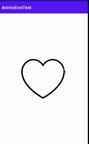
: 어떤 이미지나 탭을 클릭했을 때, selector를 이용해서 상태에 따라 이미지를 변경하거나 텍스트 색을 변경해 보셨을 겁니다.
state_selected = true / false 로 판단을 하기 때문에 2가지 상태로 변경이 가능했는데, 위의 예제에서 만들었던 Frame Layout과 animated-selector를 이용해서 2가지 상태로 바로 변하지 않고 천천히 변경되는 효과를 낼 수 있습니다.
- 앞의 예제에서 만들어봤던 FrameLayout (각 이미지 얼마큼 보여줄지 차례대로)을 만들어줍니다. (좋아요를 클릭할 때 애니메이션을 적용하기 위해 색이 변하면서 차오르는 하트 이미지를 가져왔습니다.)
res/drawable/charge_heart.xml
<?xml version="1.0" encoding="utf-8"?>
<animation-list xmlns:android="<http://schemas.android.com/apk/res/android>"
    android:oneshot="true">
    <item android:drawable="@drawable/empty_heart"
        android:duration="100"/>
    <item android:drawable="@drawable/middle_heart"
        android:duration="100"/>
    <item android:drawable="@drawable/full_heart"
        android:duration="100"/>
    <item android:drawable="@drawable/last_heart"
        android:duration="100"/>
</animation-list>- animated-selector에 transition태그에 만들어둔 FrameLayout을 적용합니다.
res/drawable/clicklikebtn.xml
<?xml version="1.0" encoding="utf-8"?>
<animated-selector xmlns:android="<http://schemas.android.com/apk/res/android>">
    <item android:id="@+id/selected"
        android:drawable="@drawable/last_heart" //처음 클릭 했을때 이미지
        android:state_selected="true" />
    <item android:id="@+id/unselected" //다시 클릭 했을때 이미지
        android:drawable="@drawable/empty_heart"
        android:state_selected="false" />
    <transition
        android:drawable="@drawable/charge_heart"
        android:fromId="@id/unselected"
        android:toId="@id/selected"/>
</animated-selector>- android: fromId : selected → unselected 로 갈지, unselected → selected로 갈지, 어떤 상태에서 애니메이션을 시작할지 결정합니다.
- android: toId : 애니메이션이 끝난 후 어떤 상태로 끝낼지 결정합니다.
처음 하트가 비워져 있을 때로 시작해서 전부 채워진 하트로 끝나기 때문에 unselected이미지에서 selected 이미지가 되도록 설정했습니다.
*좋아요를 다시 누를 때 애니메이션 설정을 하고 싶다면, transition을 하나 더 만들어 fromId=“selected” 에서 toId=“unselected”로 바꿔주고 아까 만들어둔 FrameLayout의 이미지를 반대로 배치하면 되겠죠 ;)
- 이미지의 src를 animated-selector가 포함된 drawable파일로 설정해 주고, 클릭했을 때 isSelected를 변경해 주면 완성입니다.
res/layout/activity_main.xml
<ImageView
        android:id="@+id/img_like"
        android:layout_width="200dp"
        android:layout_height="200dp"
        android:src="@drawable/click_like_btn"
        app:layout_constraintBottom_toBottomOf="parent"
        app:layout_constraintEnd_toEndOf="parent"
        app:layout_constraintStart_toStartOf="parent"
        app:layout_constraintTop_toTopOf="parent" />
MainActivity.kt
val imgLike = findViewById<ImageView>(R.id.img_like)
imgLike.setOnClickListener {
     it.isSelected = true
}
Frame Layout에 단계별로 이미지 개수를 늘리고 duration을 줄이면 조금 더 자연스러운 애니메이션 효과를 낼 수 있을 거 같습니다.
Transition Animation
마지막으로 화면 전환 시 가장 많이 나타나는 애니메이션을 적용해 보겠습니다.
ex) 갤러리에서 이미지 선택했을 때의 애니메이션
- SharedElements
- : 액티비티나 프래그먼트를 전환할 때, 지정 컴포넌트를 각각 공유하는듯한 느낌으로 애니메이션 효과를 주는 기법
❗️ Material Design을 기반으로 동작하기 때문에 API level 21 이상이 여야 합니다.
- 사진을 보여줄 이미지뷰를 만들어줍니다.
res/layout/activity_main.xml
<ImageView
        android:id="@+id/img_cat"
        android:layout_width="200dp"
        android:layout_height="200dp"
        android:transitionName="cat"
        app:layout_constraintBottom_toBottomOf="parent"
        app:layout_constraintEnd_toEndOf="parent"
        app:layout_constraintStart_toStartOf="parent"
        app:layout_constraintTop_toTopOf="parent" />
확대시키기 전 원래 이미지를 보여줄 레이아웃입니다.
res/layout/activity_detail.xml
<ImageView
        android:id="@+id/img_cat"
        android:layout_width="match_parent"
        android:layout_height="match_parent"
        android:transitionName="cat"
        app:layout_constraintBottom_toBottomOf="parent"
        app:layout_constraintEnd_toEndOf="parent"
        app:layout_constraintStart_toStartOf="parent"
        app:layout_constraintTop_toTopOf="parent" />
확대 후 커진 이미지를 보여줄 레이아웃입니다.
❗️여기서 확대시키기 전의 사진을 나타낼 imageView와 확대시킨 후의 사진을 나타낼 imageView의 transitionName에 같은 값을 넣어줍니다.
- android:transitionName : 애니메이션을 공유할 레이아웃에 사용되는 이름
- 그다음 이미지를 set 하고 intent에 이동하려는 액티비티를 설정해 url 넘겨줍니다.
MainActivity.kt
val imgCat = findViewById<ImageView>(R.id.img_cat)
        val imgUrl = "https://lh3.googleusercontent.com/proxy/-Nf_Wz-eDqZjx_zspzQ1zs28W4XeEi-jDfTNthCFhipgJvjgRILpY-kWRFheRbveCJ4HrawAT3VsIoXZiPLFYwFR8oJxavAVGVfIlSrtk-29wViCQA"
        Glide.with(this).load(imgUrl).centerCrop().into(imgCat)

        imgCat.setOnClickListener {
            val intent = Intent(this, DetailActivity::class.java)
            intent.putExtra("resId",imgUrl)

            ActivityCompat.startActivity(
                this, intent,
                ActivityOptionsCompat
                    .makeSceneTransitionAnimation(
                        this, imgCat, imgCat.transitionName
                    ).toBundle()
            )
        }
Glide라이브러리를 이용해서 확대시킬 이미지를 이미지뷰에 설정해 줬습니다.
DetailActivity로 넘긴 이미지가 확장되어 나오는 애니메이션을 구현할 것이기 때문에 imgUrl값을 putExtra로 전달하고 , 이동 애니메이션을 만들기 위해 ActivityOptionsCompat.makeSceneTransitionAnimation (context, 이미지뷰, transitionName)을 넣어줍니다. 참고
- ActivityOptionsCompat 에서는 makeScenceTransitionAnimation이외에도-makeScaleUpAnimation-makeThumbnailScaleUpAnimation
- 등 다양한 API가 있었습니다. 나중에 공부해보면 좋을것 같습니다. ㅎㅎ
- -makeClipRevealAnimation
- -makeCustomAnimation
- 확대된 사진을 보여주는 액티비티에서 적용할 애니메이션 효과 설정
DetailActivity.kt
@RequiresApi(Build.VERSION_CODES.LOLLIPOP) //API 21이상부터 사용
    override fun onCreate(savedInstanceState: Bundle?) {
        setContentView(R.layout.activity_detail)

        window.sharedElementEnterTransition =
            TransitionSet().apply{
                interpolator = OvershootInterpolator(0.5f)
                ordering = TransitionSet.ORDERING_TOGETHER
                addTransition(ChangeBounds().apply {
                    pathMotion = ArcMotion()
                })
                addTransition(ChangeTransform()) //scaltype 관련
                addTransition(ChangeClipBounds())
                addTransition(ChangeImageTransform())
            }
        super.onCreate(savedInstanceState)

        val resId = intent.getStringExtra("resId")
        val imgCat = findViewById<ImageView>(R.id.img_cat)
        Glide.with(this).load(resId).into(imgCat)

        imgCat.setOnClickListener {
            finishAfterTransition()
        }
}- window.sharedElementEnterTransition : 호출하는 활동의 나가기 전환을 정의합니다.
- interpolator : 시작시점과 종료 시점까지의 변화과정을 어떤식으로 표현할 것인가를 정의합니다. 애니메이션이 완료된 후 살짝 튕기는 느낌을 주기위해 OvershootInterpolator를 사용했습니다. [다양한 interpolator 효과 참고] (https://gus0000123.medium.com/android-animation-interpolar-구현하기-8d228f4fc3c3)
- ArcMotion() : 끊기는 느낌 없이 부드러운 이동을 위해 사용합니다.
- finishAfterTransition() : 장면 전환 애니메이션을 역전시킵니다.
window.sharedElementEnterTransition { } 부분이 없어도 애니메이션 효과가 나타나긴 하지만, TransitionSet을 공부하며 원하는 느낌을 적용해 보면 좋을 것 같습니다. : )

애니메이션을 언젠가 써봐야지 하다가 처음 접해봤는데, 만드는 방법이 낯설지만 다양한 효과를 만들 수 있을 것 같습니다. 다음번엔 recyclerView에서의 애니메이션, ObjectorAnimator를 공부해 봐야겠습니다.🙂
참고
리소스 : https://developer.android.com/guide/topics/resources/drawable-resource?hl=ko
애니메이션 : https://itmir.tistory.com/515
Transition Animation : https://developer.android.com/training/transitions/start-activity
Shared Elements : https://mikescamell.com/shared-element-transitions-part-1/
이미지 출처 : https://www.flaticon.com/packs/artificial-intelligence-31, http://www.foodnmed.com/news/articleView.html?idxno=18296